
Improving Engagement Through Informed Research and Design
Redesigning how users navigate the San Francisco Community Music Center website
Project Synopsis
Overview:
San Francisco Community Music Center (CMC) makes high-quality music accessible to people of all ages, backgrounds, and abilities, regardless of financial means. In light of COVID, CMC had to move most of its programs online. Although they have made a successful transition in providing online options, and there is a good amount of interest, they have noticed a significant drop-off in enrollments and donations. They came to us, a team of 3 UX Designers, to redesign the online experience for their users.
Duration:
2 Week Design Sprint
Team:
3 UX Designers
Concept Client:
San Francisco Community Music Center (CMC)
My Role:
I took the role of project manager and lead researcher of the project. I organized our project plan and made sure all group members were completing their assigned tasks efficiently. I created the project’s research plan and synthesized responses to surveys and user interviews.
In addition, I collaborated with my teammates throughout the entire process including the research, synthesis, problem definition, solution proposal, and design.
Tools:
Pen & Paper
Miro
Figma
Google Forms
Google Sheets
Methods:
Contextual Inquiry
User Interviews
Survey Questions
Competitive Analysis
Comparative Analysis
Heuristic Analysis
Card Sorting
Affinity Mapping
Persona Development
Design Studio
Sketching
Wireframing
Prototyping
Usability Testing
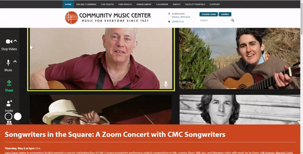
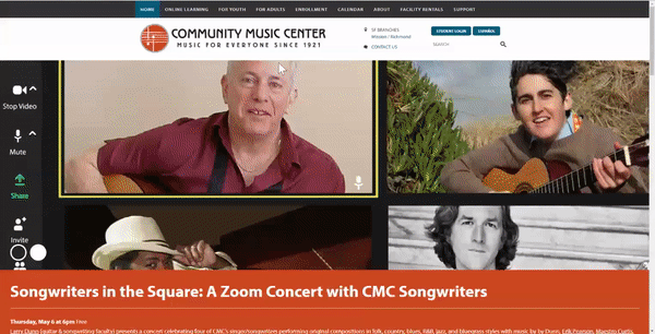
CMC’s Navigation Nightmare
One of the biggest challenges users face while on the CMC’s website is its navigation structure. The information architecture is difficult to understand with similar landing pages under multiple tabs. Users constantly find themselves brought to pages they did not expect to arrive at, and have no clear way to explore the site and learn about what CMC has to offer.
Understanding the Mess
Through detailed user research techniques, we were able to discover the major pain points of CMC’s users. We discovered their existing user flow has too many steps and by observing users walk through specific tasks on the current CMC website we understood why these issues arise.
Key Takeaways:
Inconsistent Global Navigation
Multiple ways to one page, but no way out
Enrollment is only available over the phone
Donations through third party site
No clear CTAs (Call to Action)
Who has to deal with this
After gaining an understanding of the problems users face, the team began conducting user research to learn more about who these users are. By sending out a survey and conducting user interviews we were able to construct two user personas to base our design around.

Key Takeaways:
Musicians are comfortable switching to an online platform
Musicians’ learning preferences
Musicians want to build a personal relationship with their instructor

How to clean it up
Now that we know what is wrong and who is struggling we can effectively create a design strategy to solve these issues. The focus of our approach was improving navigation and eliminating errors for users. The first step in solving the navigation issues is to understand how users organize information.

Design Hypothesis:
By applying navigation principles and error prevention techniques we believe we will remove uncertainty felt by users when navigating through the website and improve the findability of specific user interests.

Mapping out the new CMC
Running a card sorting exercise with users gave us valuable insights into how users understand the features in the global navigation. The creation of a new site map allowed us to reorganize where information is placed throughout the global navigation. By reconstructing the navigation elements of the website we were able to create a much more efficient user flow for common tasks.
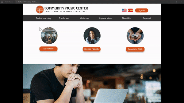
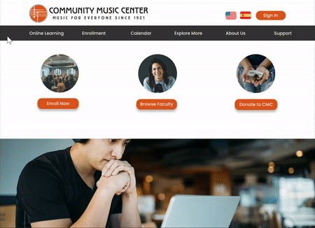
Giving the users power
By improving the navigation we gave users more freedom to learn more about CMC’s programs and instructors so they can make informed decisions on what class they want to join as well as who is teaching them. We placed clear CTAs on the landing page so users do not have to search around for where to click. We also improved the faculty profiles to include more relevant information so potential users can browse faculty and select an instructor that fits their learning style.
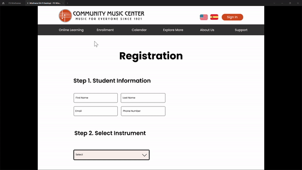
The Enrollment Issue
Currently, CMC only offers the ability to schedule an informational phone call, which the user would use to learn more about available courses and instructors that fit their schedules. Our goal is to allow users to research courses and instructors on the website so they do not have to waste time waiting for this phone call. Once users do their research and are happy they can schedule a one-on-one video call with the instructor.
Reflections
Test and Test again
The most valuable insights I received were during the second or third phase of testing. You may receive the largest amount of data during your initial testing, but during the later tests, you will discover new and important details that were not mentioned earlier.
Communication is key
Ending the day with a quick write up including what was accomplished today and what needs to be completed tomorrow is a great way to keep the whole team on track.